
Charting the history of financial instruments such as shares, bonds or currency pairs is a discipline widely used by professional analysts and traders alike to identify recurring price patterns. Also known as technical analysis, this type of research uses historic price patterns to determine the likelihood of where prices might head in the future.
There are literally hundreds of different indicators employed by technical analysts, some to measure momentum and others to gauge the normal trading range of the instrument in question. This article aims to provide a very basic introduction to reading charts and will hopefully help anyone needing to convert currencies make better-informed decisions about their transactions.
One type of chart that helps illustrate price action is the candlestick chart. So called as its appearance resembles a candlestick with a wick at the top, a candlestick chart gives a visual representation of each price bar. The price bars can depict each tick, minute, day, month or some other trading period of a currency pair:-
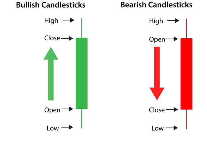
The thin line shows the range between the trading high and low of the currency pair and the thicker body shows the level at which the price opened and closed for the period in question. If the close price is higher than the opening price then the bar is seen as bullish and if the close is lower than the open, the bar is viewed as bearish. Bullish candlesticks are often coloured green and bearish candlesticks red for ease of interpretation. A series of green candlestick bars would be seen as evidence of buying pressure and therefore a bullish sign, particularly if the candlesticks are long. The opposite view would be taken for a series of long red candlesticks.
The shape of the candlestick can also be used to try and identify potential reversal patterns. The ‘hammer’ candlestick has a short body positioned at the upper end of the trading range with either little or no upper wick at the top. They can be coloured green or red:-
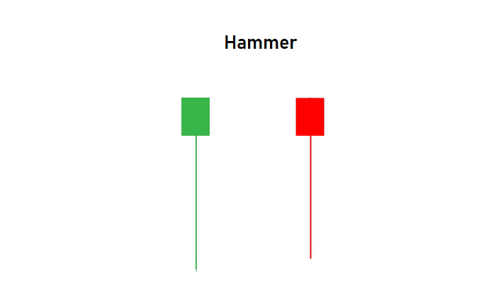
This pattern shows that sellers have driven prices lower during the trading session but then a significant reversal has taken place. Buyers take over to drive the price higher ending the session on a high note. This pattern is not important on its own but gathers more significance if it appears after a series of downward trending candles. Confirmation of the reversal appears when prices subsequently trade above the high of this range in the next bar.
An inverted hammer, on the other hand, can be a sign of buying pressure drying up after a series of bullish candles and one should watch out for confirmation of the reversal before taking action.
The Doji is a candlestick pattern that forms when the opening and closing price are at the same level on the trading bar resulting in a thin body and a cross like appearance: –
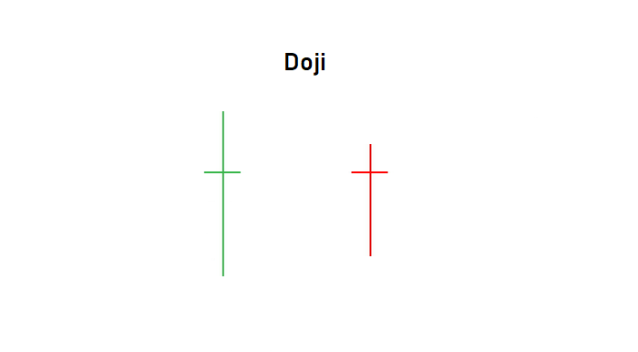
The Doji pattern shows that the trading session ended with buyers and sellers at equilibrium and can be viewed as a period of indecision or consolidation. Whenever a Doji appears at the top of a trend, in an overbought area, traders will look for signs that the trend is about to come to an end. Conversely, a Doji seen at the bottom of an extended downtrend requires buying signals the next day to confirm the reversal.
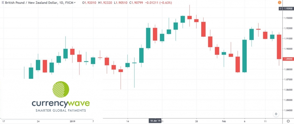
Below is a daily chart of GBP/NZD to illustrate how a series of candlesticks might appear – see if you can spot the hammers/inverted hammers and Doji’s that gave a clue to the impending trend reversals:-
Another simple technique used by technical analysts is to try and identify reversals in trend which are flagged by prices breaking through areas of resistance or support. These simple trend lines can be drawn by connecting two or more tops (or bottoms) on a trending chart such as seen below:-
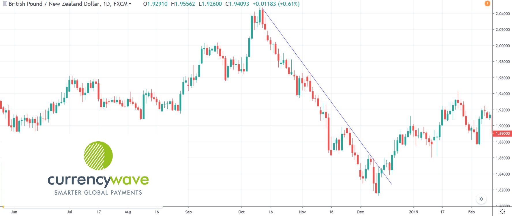
A technical analyst would view the breakout of this upper trendline as a potential turning point in the chart. Similarly, in an upward trending chart one might draw a trendline connecting a series of bottoms and look for a break of this line as a clue that the trend is about to change.
It is important to note that using trendlines in isolation are not always a reliable tool. As with all technical analysis it is imperative to build up a complete picture using a variety of signals. The more signals there are confirming a potential reversal of trend, the higher the likelihood of the expected outcome.
The use of technical analysis is by no means an infallible science. It can, however, provide some insight into the likely direction of future prices and improve the odds of identifying important turning points to maximise your currency conversion.
More Insights